Designing a nurturing identity for wholesome baby nutrition.
Overview
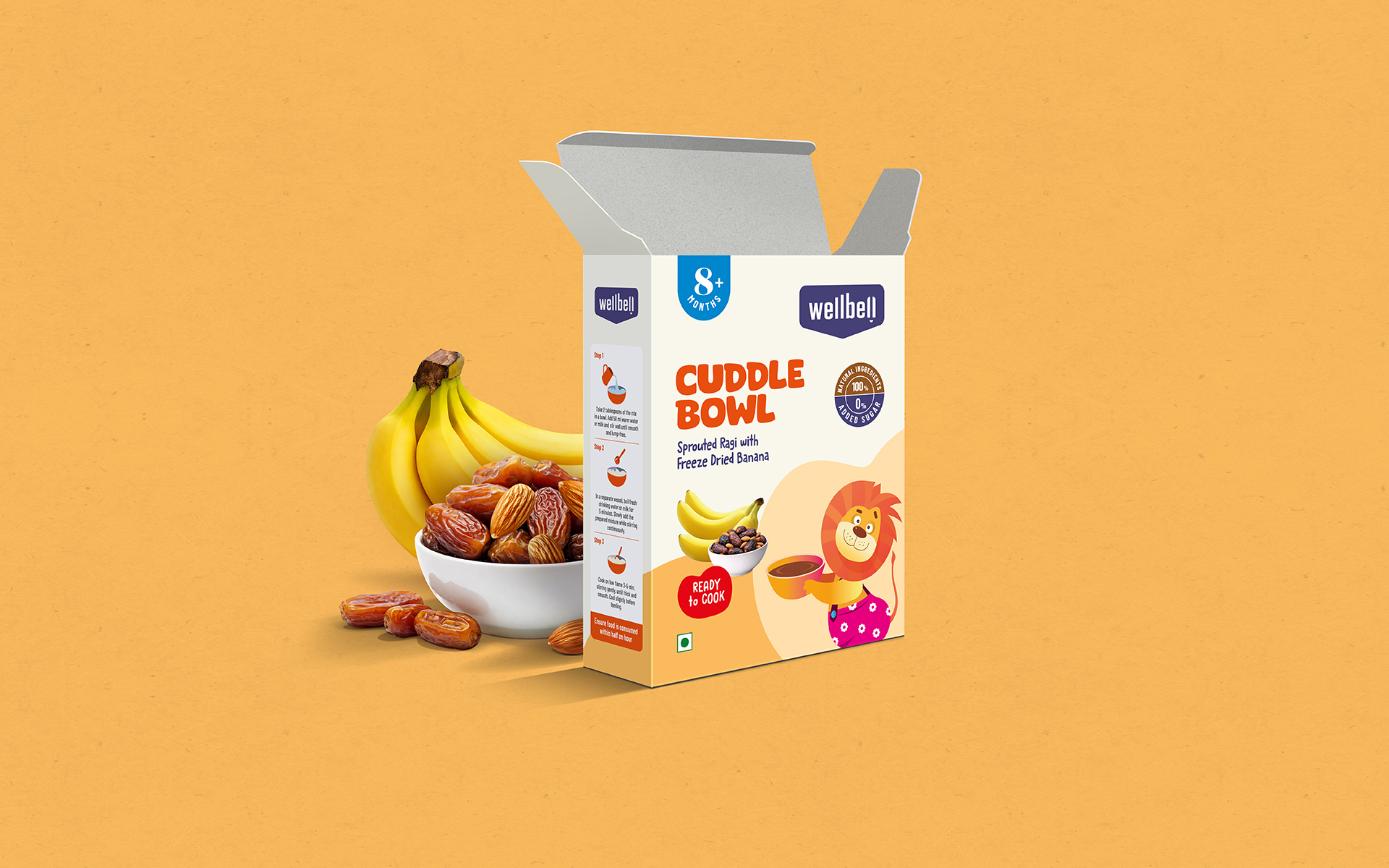
For this baby food packaging project, we created a brand world centered on purity, care, and conscious nourishment-inspired by the promise of a child’s first foods, and celebrating ancient millets, naturally soaked grains, and real fruits with no additives or shortcuts.
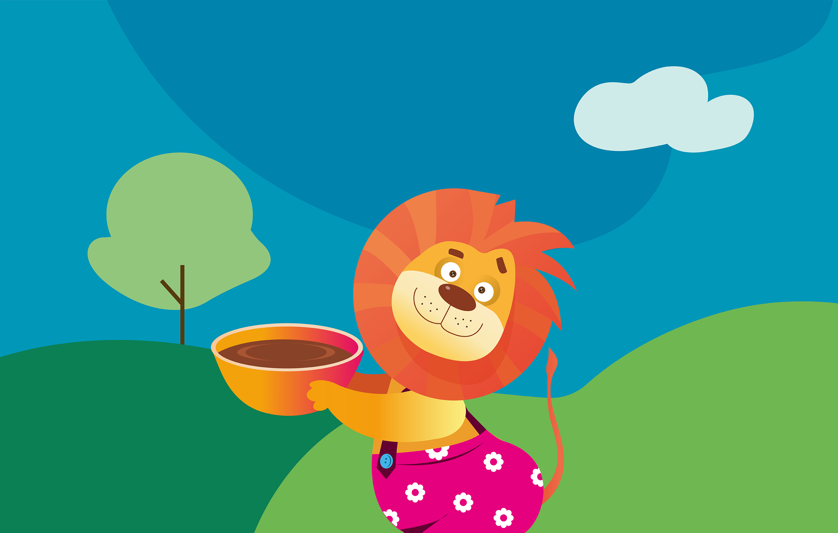
At the heart of the visual identity is a playful illustration of a cheerful young lion holding a warm bowl of porridge. Friendly, expressive, and protective, the character symbolizes strength wrapped in tenderness — creating an immediate emotional connection with both children and parents. The lion adds personality to the pack while reinforcing a sense of safety, care, and nourishment.
A Little Lion with a Big Promise
Soft earthy tones, gentle curves, and clearly structured information panels bring clarity and warmth to the design. The clean layout, combined with honest ingredient communication and intuitive preparation visuals, reflects what the product truly stands for: simple, wholesome nutrition crafted thoughtfully for tiny tummies and growing smiles.
